Screen
A screen artifact page typically documents the following information:
- The business purpose of the screen
- Its look and feel
- The information displayed to the user and the display conditions
- Screen inputs and validations
- Screen transitions and function calls
Template
Most screen documentations include the screen description, wireframe/screenshot depicting the look of the screen and the list of screen elements along with the description of their behavior:
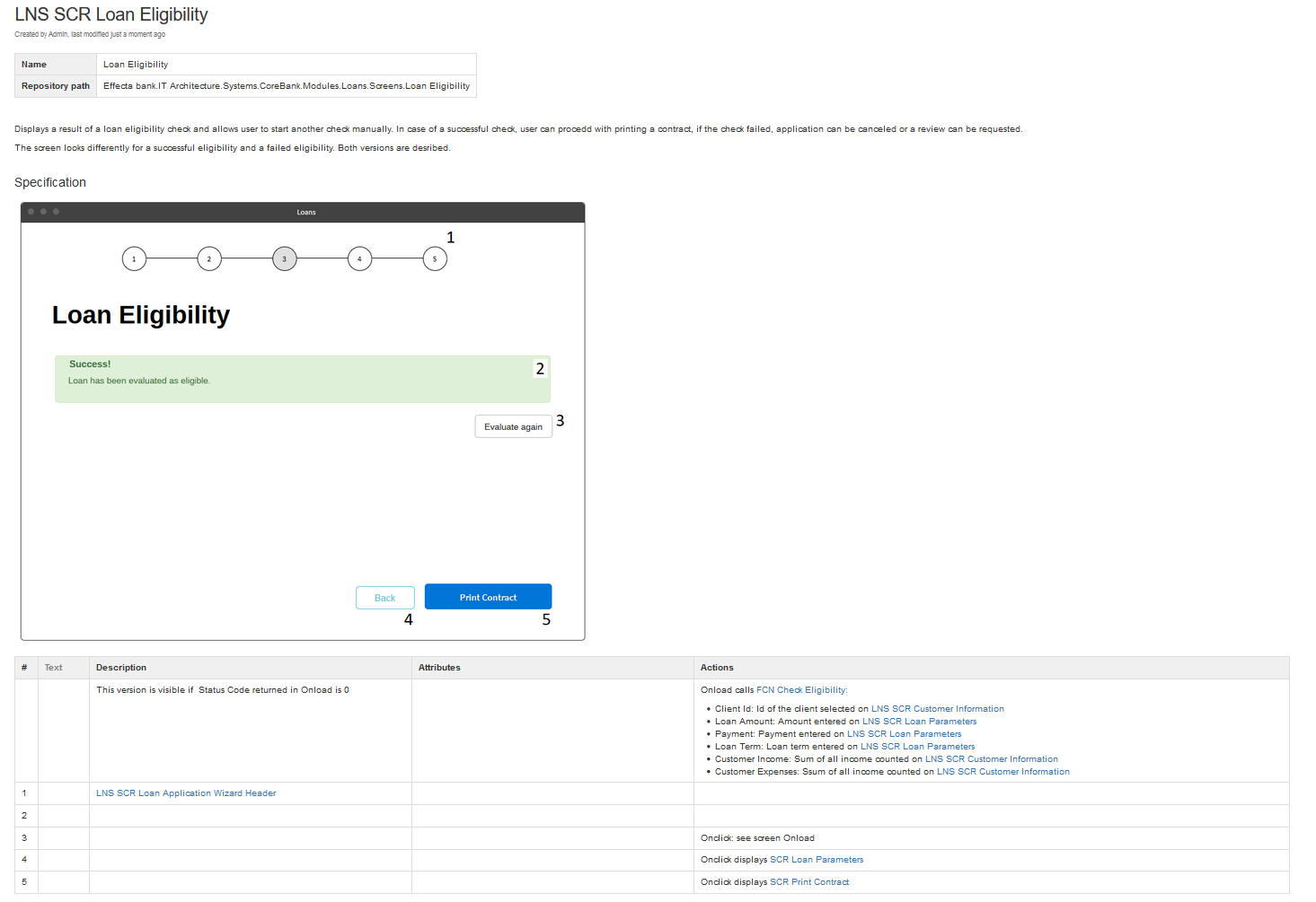
Table columns description:
| Column | Description |
|---|---|
| # | Id of the screen element. Empty if the row describes behaviour of the whole screen. |
| Text | A screen element label. Could be used if the text is not readable from the picture or to provide translations. |
| Description | Business description of the element. Written in business language, does not contain technical details. Specifies the purpose of the element, activity steps, or screen transitions. Does not state data loads or service calls. |
| Attributes | Attributes define characteristics and behaviour of the element. Depending on the element type, they can define whether or when the element is visible (table), enabled (button), editable (textfield), etc. The complete list of attributes is defined below. |
| Action | Actions describe what should happen on the screen and when. For example, if the button triggers calling the 'Calculate Tax' function, it is defined as Onclick: Calls 'Calculate Tax' function. The complete list of actions is defined below. |
Attributes
Attributes define the characteristics and behavior of the UI element. A separate set of attributes is defined for each element.
Note: If the attribute is not needed for the given element and screen, do not include it in the specification.
All Elements
| Attribute | Description |
|---|---|
| Visible | Defines whether the element is visible or not. Contains a condition or Yes/No. Default is Yes. |
| Enabled | Defines whether the element is enabled or not. Enabled means that the element is active - the button can be pressed, the input field can be edited, etc. Contains a condition or Yes/No. Default is Yes. |
| Readonly | The element is not disabled, but the value cannot be changed. Default is No. |
Table
| Attribute | Description |
|---|---|
| Items | Data collection which populates the table, including the data source. |
| Columns | Table columns, each specified on a separate row. |
| Sorted by | Defines default sorting. It can be a column or a general sorting criterion. |
| Sortable by | Columns which allow sorting |
Item List
Any element displaying a list of values - a drop-down list or just a bulleted list, for example.
| Attribute | Description |
|---|---|
| Items | See Table |
| Sorted by | See Table |
Input Field
Any input field, such as text or text area.
| Attribute | Description |
|---|---|
| Format | Defines a value limitation to text, number, date, etc. |
| Maxlength | Input field will not allow entering a value longer than the maxlength. Without restriction by default. |
| Password | The input value is masked as a password. Values: Yes/No. Default is No. |
| Placeholder | A helper text. Disappears when the user put some text into the field. |
Actions
Actions define events triggered by the UI:
| Event | Description |
|---|---|
| Onload | The event occurs when the screen has loaded |
| Onclick | The event occurs when the user clicks on an element |
| Onchange | The event occurs when the content of a form element has changed (input field text change, checkbox value change, etc.) |
The table above lists just the three most frequent events. For other actions, please refer to this list.
Examples
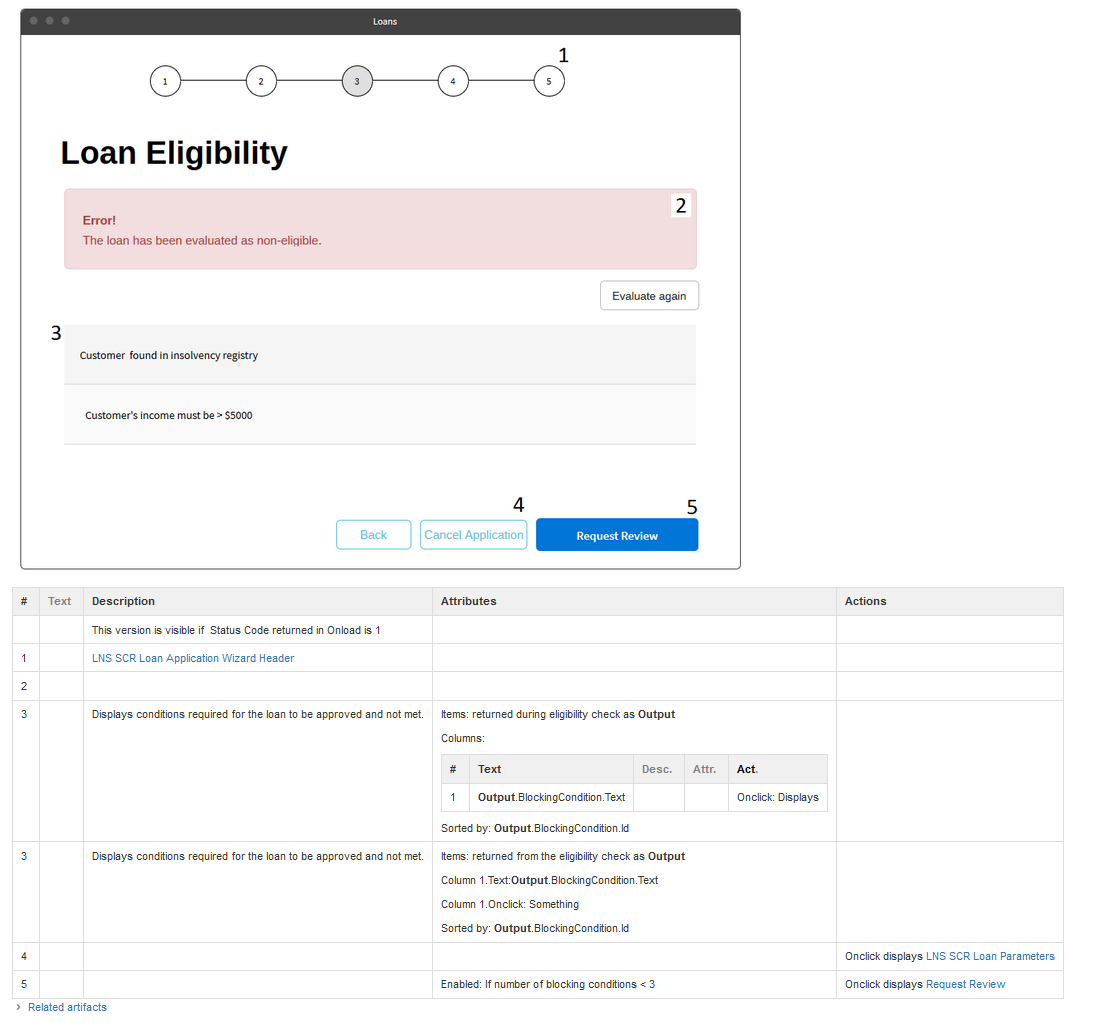
The first example shows a slightly more complicated version of the screen from the beginning of this section - in this case, the eligibility check was not successful. It demonstrates displaying data in a table, conditional hiding screen elements, and processing the incoming data object. Also, note two possible ways of describing the content of the table (element #3).
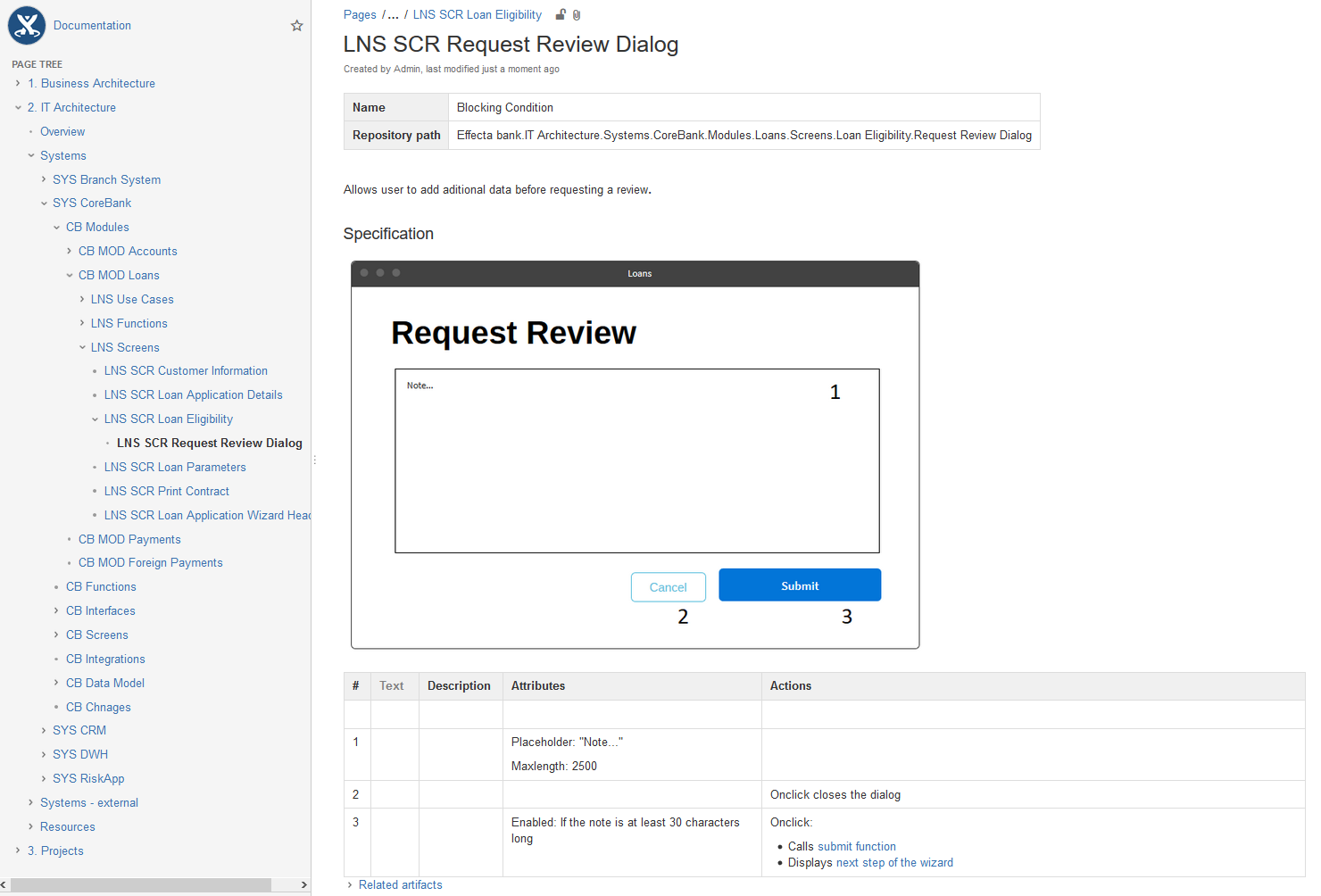
The second example presents a simple dialog which allows user to enter instructions for the eligibility reviewer. It demonstrates documenting input fields and validations.
Note the use of the declarative approach for controlling when the button should be enabled: it does not say "If the value of the text area changes, the length of the text is checked and if it exceeds 30, the button gets enabled." Instead, it just declares the conditions when the button should be enabled or disabled. This makes the description concise and easier to understand.